Case study · Well Covered Solutions
A brand and website for a Las Vegas insurance broker.
Well Covered Solutions is an independent health and life insurance broker in Las Vegas. We gave it a brand system, designed and built a new website, and set up a way to change the site by email. It went live on October 7, 2026, six days after the first brand board.
- Brand system
- 33-page website
- Changes by email
- Client
- Insurance broker, Las Vegas
- What we did
- Brand, website, changes by email
- Live since
- October 7, 2026
- Pages
- 2 before, 33 now
One broker, seven states, a site with two pages.
Who Well Covered is
Well Covered Solutions is an independent health and life insurance broker in Las Vegas, Nevada. One licensed broker, Ollie Gougaud, helps individuals, families and small businesses compare plans and enroll, in seven states.
Where it started
The old site was a single page on WordPress, plus a privacy policy, so no kind of coverage had a page of its own. In September we rebuilt it with a page for each one, an accessibility audit and a redirect for every old address. On October 1 we started the design over, brand first.
What it needed
- A page for each kind of coverage: ACA health, small business, dental and vision, and life insurance.
- A short path to a quote online, or to a message when someone would rather talk.
- A look people can trust with health and money questions, that doesn’t pass for a government site.
- A site Ollie can change without learning a content system.
- His rules kept on every page: licensed states only, his agent ID on every enroll link, and his license number only beside the contact form.
This is the work behind our UX and UI design and web design services.
Kept the logo. Built the rest around it.
Well Covered already had its shield logo. We kept it and built the system around it: a navy taken from the mark, one clay button per screen, and type chosen to be easy to read.
The mark


The shield stays as it is. Under 32 pixels its family and chart blur, so browser tabs get a serif W on navy instead.
Five color directions
We tried five palettes on Well Covered's real homepage, not on swatches. Cool paper, navy and clay won. The first version's blue sat almost on the blue of US government websites, and a broker's site shouldn't pass for HealthCare.gov.
- Cool paper, navy, clay buttonChosen
- Warm ivory, navy, deep teal button
- Sage paper, forest green, ochre button
- Neutral grey, navy, berry button
- A navy hero panel, clay button
The palette
- Paper#F3F6F8The page
- Ink#14212BBody text15.1:1 on paper
- Navy#153D56Links and headings, from the logo10.6:1 on paper
- Clay#8F3F1EOne button per screenWhite on it, 7.2:1
- Slate#3D4B56Hints and captions8.3:1 on paper
- Focus#0B6B7CThe focus ring5.7:1 on paper
Type
- Source Serif 4Headings
ACA marketplace plans, compared side by side
A serif with the settled look of a printed document.
- Atkinson Hyperlegible NextReading
Marketplace plans can't turn you down for a pre-existing condition.
Drawn by the Braille Institute for low-vision readers. Body text is 20px on desktop and never under 18px.
Every page drawn first, then built.
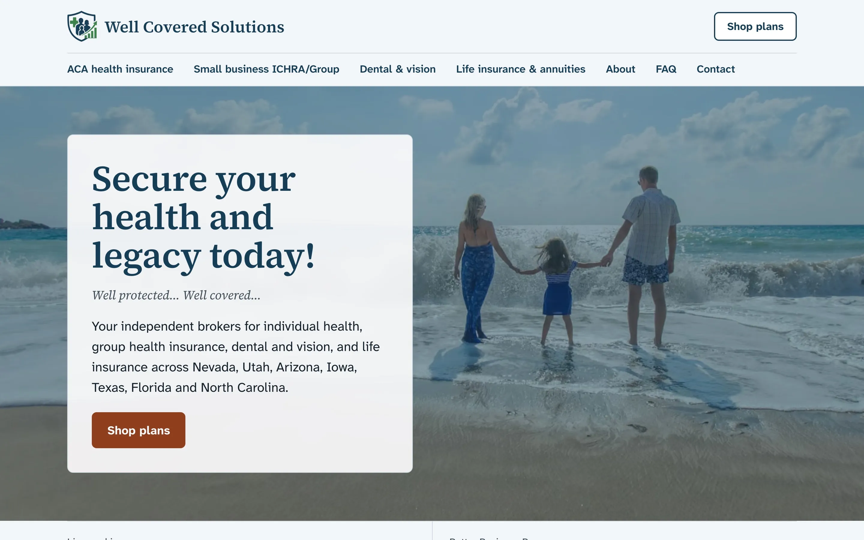
The design boards held the homepage at desktop and phone sizes, a service page template, the contact page and two sheets of components. Ollie approved the words on the boards on October 2.
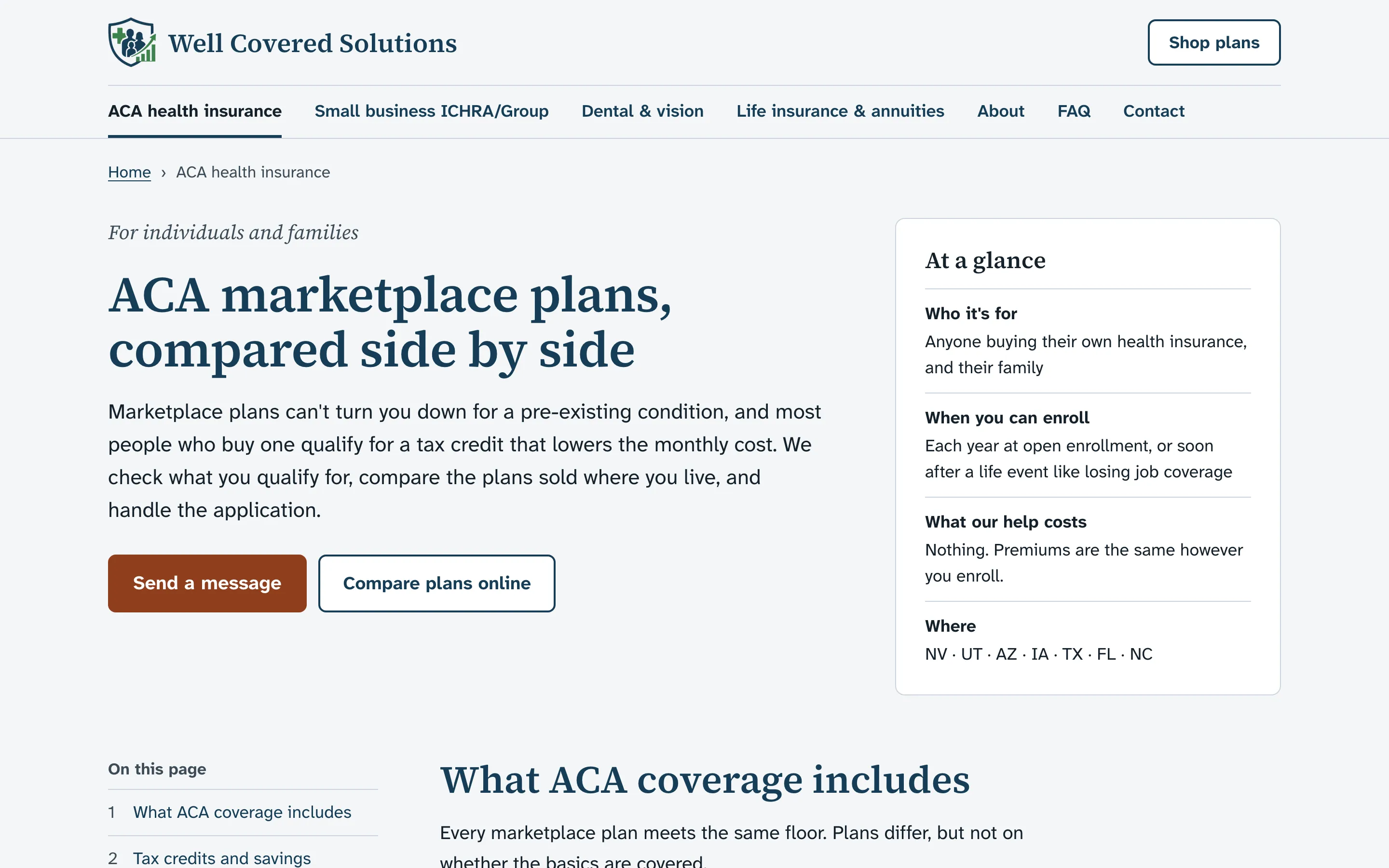
A service page from the template: the answer first, the key facts in a card beside it. 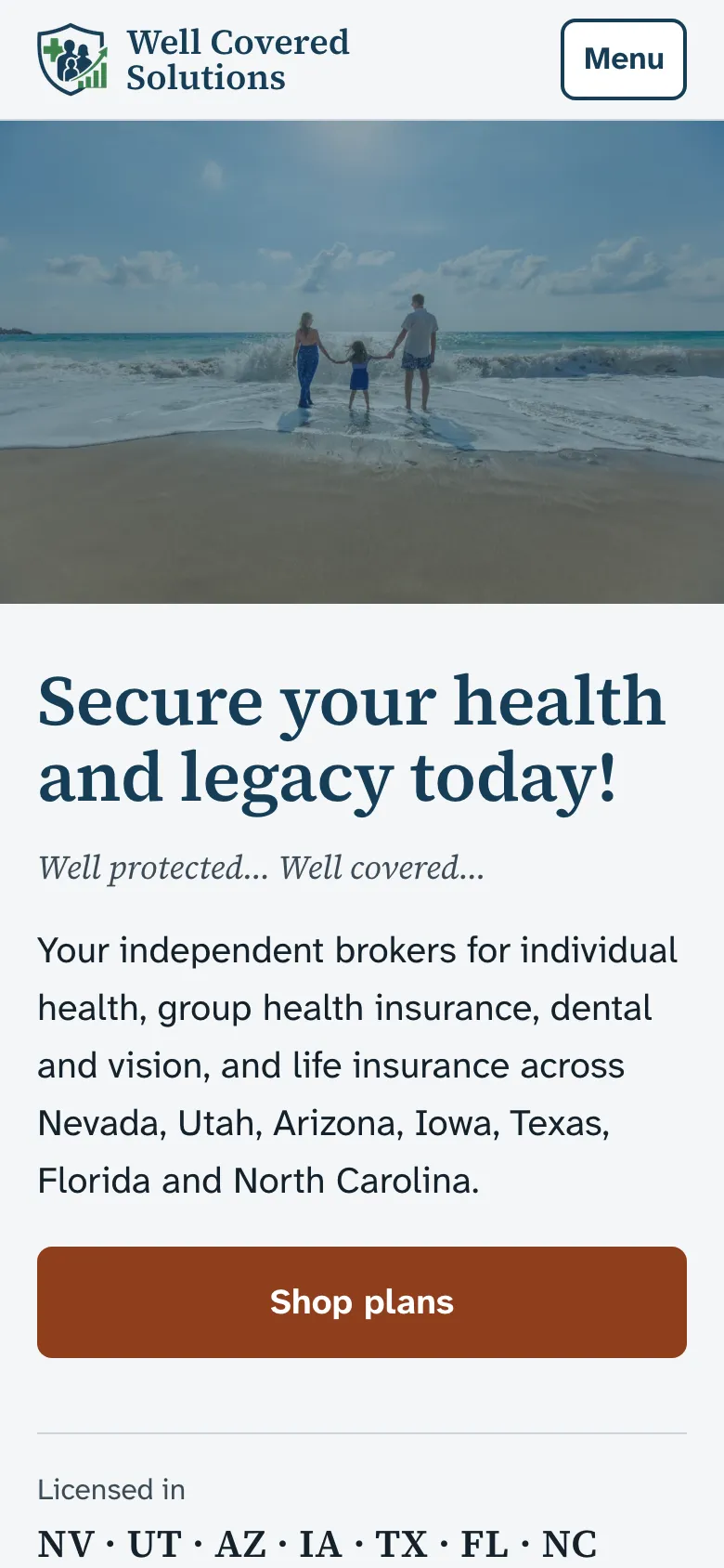
The homepage on a phone. Body text never drops under 18px. 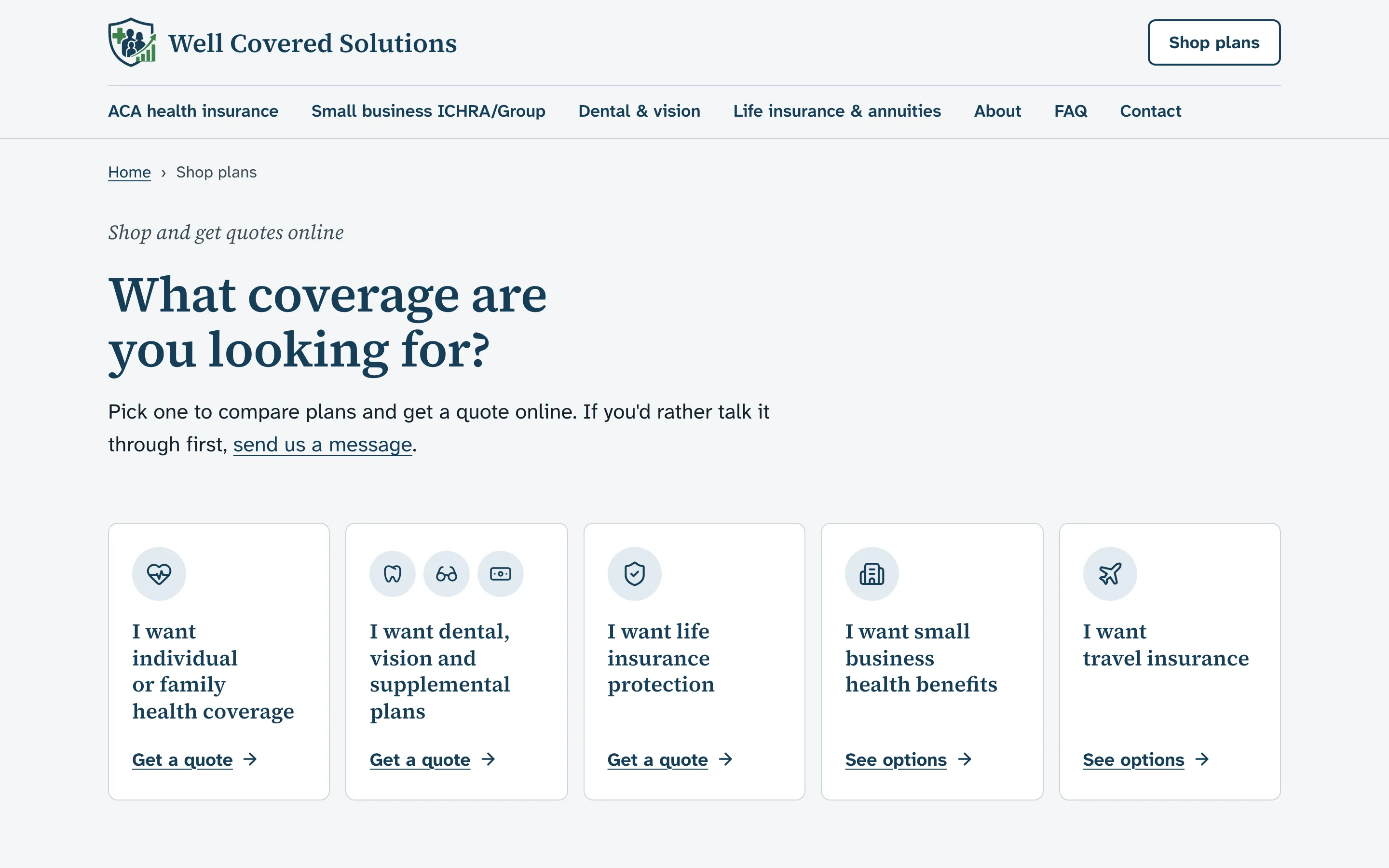
Shop plans: five kinds of coverage, each linking to a quote tool that credits Ollie as the broker. 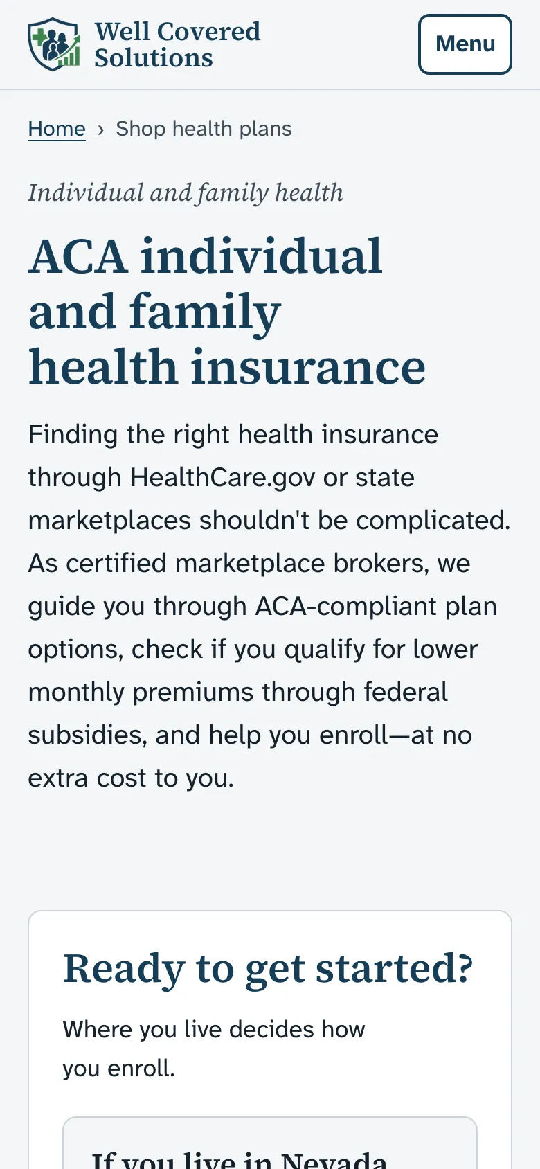
Where you live decides how you enroll, so the page asks first.
Rules the site can't break.
Insurance has rules a single typo can break. Each rule below is a test, so a mistake fails the build instead of reaching the live site.
Every quote link pays the broker
HealthSherpa, UnitedHealthOne and NCD links must carry Ollie's IDs. Without them he isn't paid for the sale, and nothing on the page would look broken.
Licensed states only
The seven states are typed once and reach every page from there. A state he isn't licensed in, or a word like "nationwide", fails the build.
Partners named correctly
HealthSherpa is "a third-party enrollment partner": never "our portal" and never "official".
License number beside the form only
His license number shows on the contact page and nowhere else, as he asked.
Text that's easy to read
Every text color clears 7:1 against its background. The contrast test fails the build if a pairing drops under 4.5:1.
Accessible on every page
Every page is checked against WCAG 2.2 AA at phone and desktop widths, and none may scroll sideways.
Changes by email
Ollie emails. He approves what ships.
An AI agent checks for his email every hour from 7am to midnight. Routine changes reach the live site without waiting on us. Anything the house rules save for Stefan waits for Stefan.
He emails a change
In plain words, from his own inbox.
An agent makes it
On its own branch, with every check run before he sees it.
He gets a preview
A private link to the changed page. No login.
He replies "approved"
Only the exact version he saw can ship.
It goes live
The agent checks the live page, then tells Ollie and Stefan it's done.
well-coded revise --client well-coveredapproved · live · checked
AI agents do the typing. Stefan makes the calls.
Well Covered was the first client site built this way. The same setup starts every site we build now.
One tested starting point
Every site starts from the same base and the same written playbook for speed, search, accessibility and launch day.
House rules in every repo
A rules file the agents read before they touch anything: the voice, the claims the business can't make and what needs a person.
Every change is a pull request
Each one gets its own preview link and the full set of checks before it can go live.
Stefan signs off
Prices, legal claims, publishing and anything new wait for his yes. The agents ask; they don't guess.
From two pages to changes by email.
- Sep 3First rebuildA page for each kind of coverage, an accessibility audit and a redirect for every old address.
- Oct 1Brand boards and a faster buildAn AI agent drew the brand and page boards from Stefan's brief. The site moved to Astro the same day, dropping about 102 kB of JavaScript from every page.
- Oct 2Words approvedOllie signed off the copy on the boards.
- Oct 7LiveThe domain moved over, and the site went live and open to search engines.
- Oct 10Shop pages and changes by emailFive ways to shop for plans online, and the email loop for his change requests.
run checks --your-business
Ready when you are.
A free 30-minute call about your business. You'll leave with a clear next step, whether or not we work together.
Book a free call